Improving the ordering experience by getting rid of indecisiveness
Role
Product Designer
Timeline
Sept - Dec 2019
Team
2 Designers
Skills
Research, UX, UI
Here before the trend
“Brothers’ Cold Brew” is a coffee shop based in Tijuana, Mx. They produce their own Cold Brew and sell it on tap or in flavored bottles.For our Futurology in Industrial Design course we were tasked with analyzing the market & megatrends of the upcoming decade and coming up with future-proofing solutions.
Although several design proposals were delivered, this case study will focus on the mobile app proposal.
My contribution
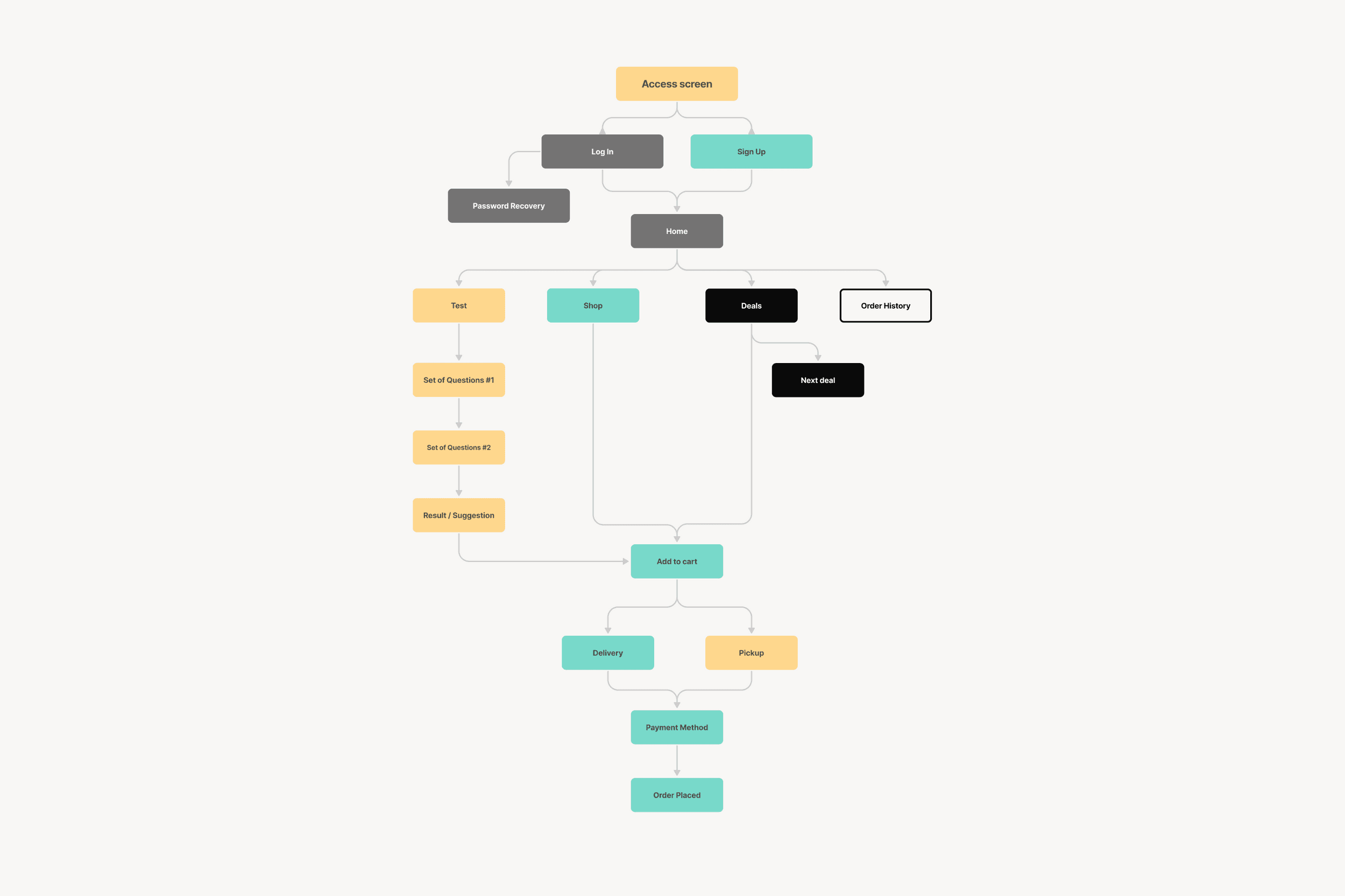
I led the concept design of BCB's mobile app. This involved creative direction based on existing branding, establishing the information architecture and the user flows, user interface design and copywriting.
Making your mark
In the past 5 years there’s been an influx of cold brew businesses in Mexico, making it hard for businesses to mantain their novelty and presence in the market.
Clients are usually in a rush or indecisive about what to order leading to longer lines and disappointment with the beverages offered. BCB doesn’t have a mobile app forcing clients to use a third party app or purchasing strictly in situ.
Problem Statement
How might we give a more personalized and engaging experience to customers that feel overwhelmed when handed several options?
Know me more than I know
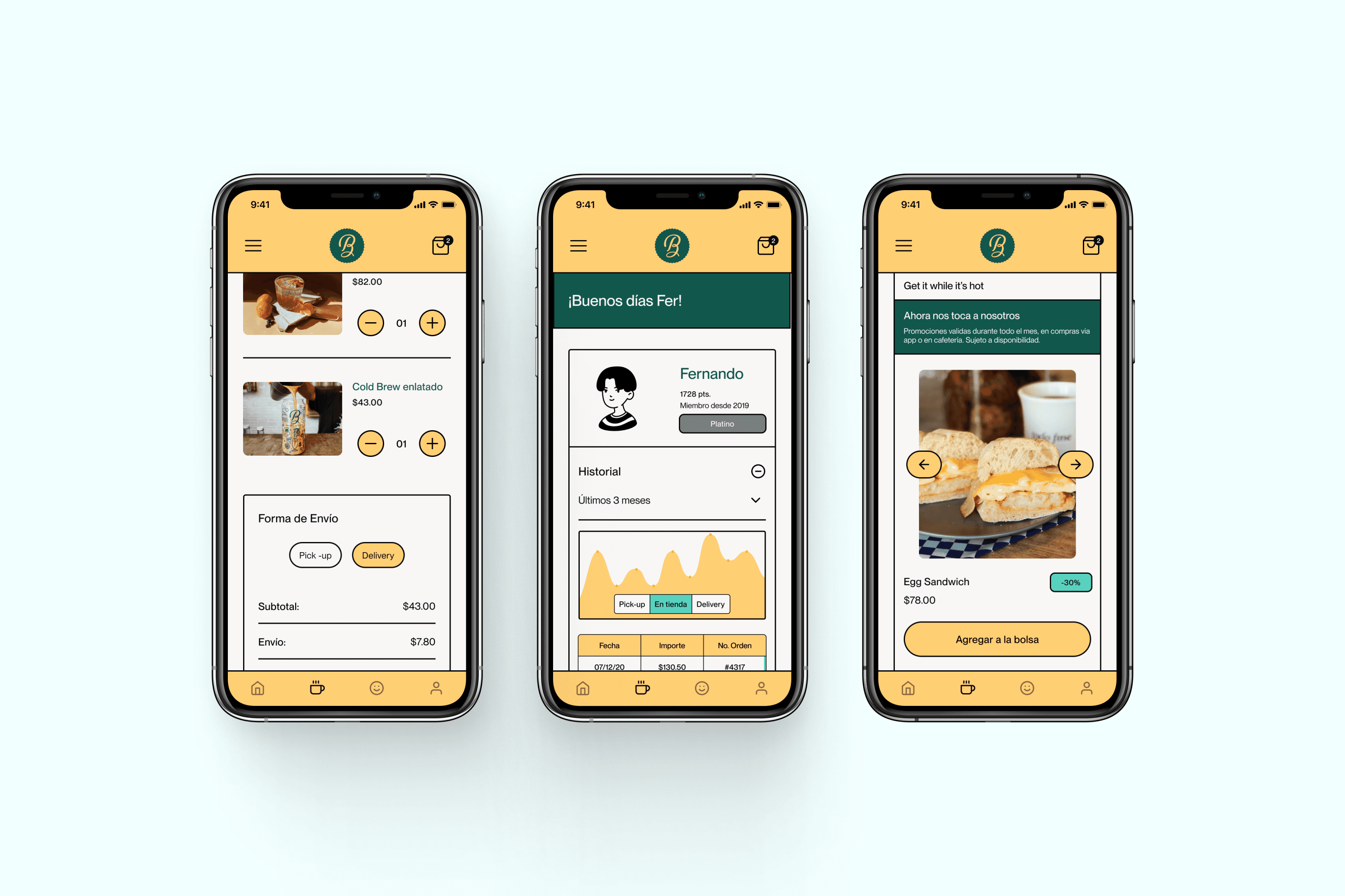
In the proposed app solution, we seek to generate customer loyalty through a points reward system, which can be traded for discounts or products during specific seasons.
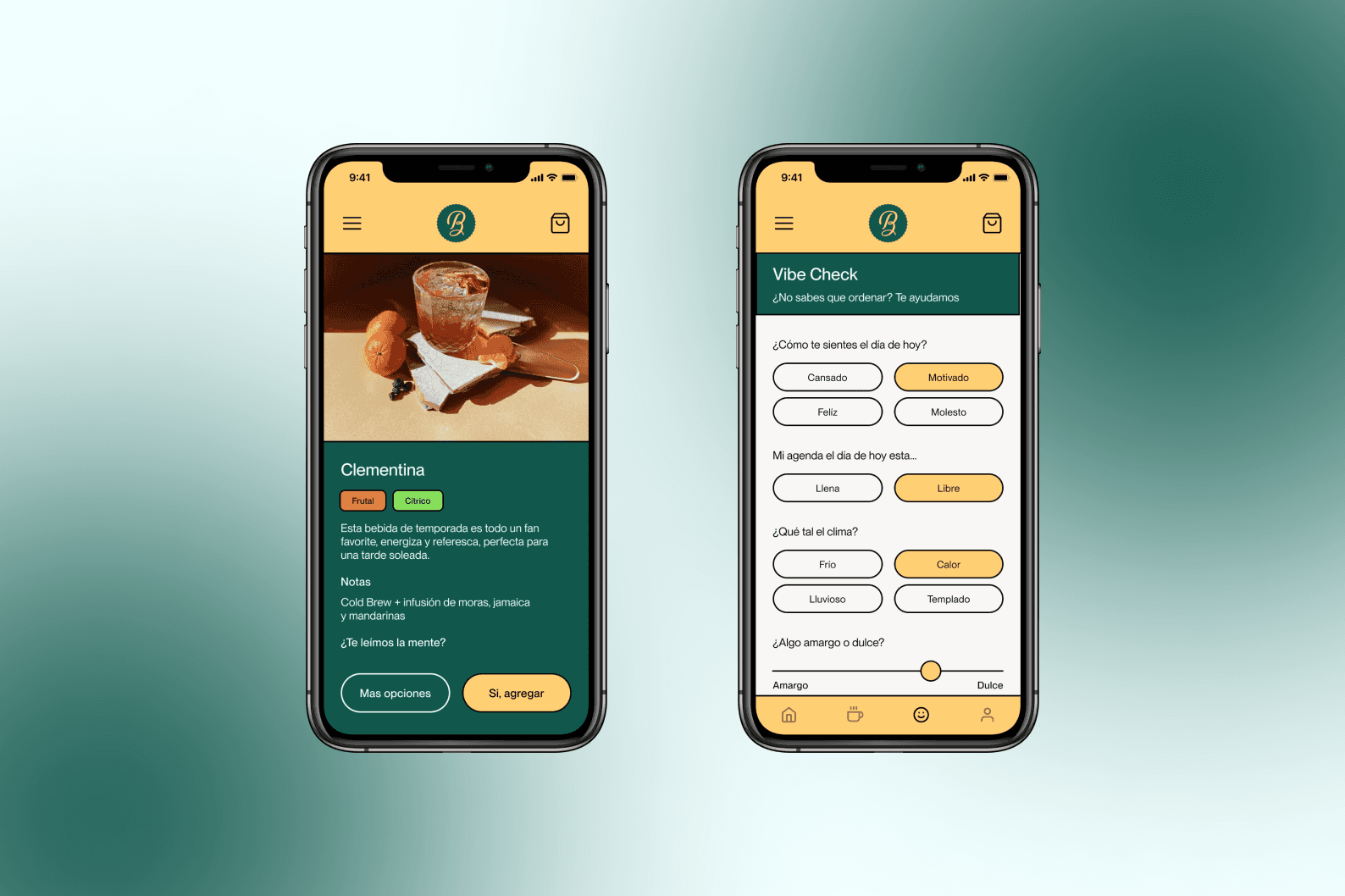
We proposed a test to match the customer’s mood, cravings and schedule. Easing the shopping experience through order history, deals and tasting sessions scheduling.
To meet the demand needs of BCB, we created an integrated online shopping system that was aligned with the rest of the multi-channel experience proposals allowing the user to order and choose payment and delivery methods.
Process
I begin by brainstorming and conceptualizing ideas for the abstract renders. I draw inspiration from various sources, such as nature, technology, dreams, or personal experiences. My aim is to create a unique and visually captivating concept that pushes the boundaries of traditional representation.
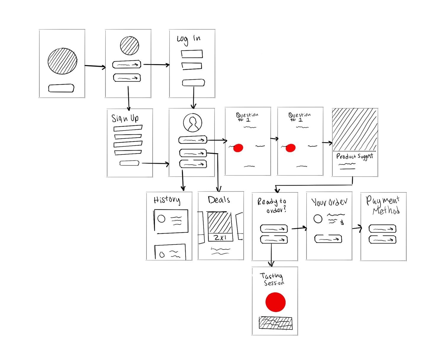
Once the concept is defined, I create rough sketches or digital sketches to visualize the composition. This helps me refine the overall structure, determine the placement of key elements, and establish a sense of balance and harmony within the artwork.
Using specialized 3D modeling software, I start constructing the virtual objects that will form the core of the composition. I create and manipulate geometric shapes, organic forms, or abstract structures. I carefully consider the overall design, proportions, and relationships between different elements to achieve the desired visual impact.
Time & knowledge
This project encompassed a few different processes, from researching and analyzing to coming up with digital and physical solutions, requiring to put on different hats and change perspectives. The deliverable stage of this projects only lasted around 2 weeks and I was required to work on other deliverables at the same time.
This was also the first time I designed an app, my limited knowledge in Figma, grid and design systems as well as WCAG standards limited my design abilities.
In the real world…
This is just a first approach and if it was a product that was actually going to be shipped it would need a lot of refinement and attention to detail. As well as designing for different scenarios.
When I designed this prototype I had little knowledge of grid and design systems as well as accessibility features, given the opportunity I would've been delighted to test it on users and iterate it.
I would’ve also tested the quiz’s efficacy and plan next steps, such as using AI for complex personalized suggestions.

Improving the ordering experience by getting rid of indecisiveness
Role
Product Designer
Timeline
Sept - Dec 2019
Team
2 Designers
Skills
Research, UX, UI

Here before the trend
“Brothers’ Cold Brew” is a coffee shop based in Tijuana, Mx. They produce their own Cold Brew and sell it on tap or in flavored bottles.For our Futurology in Industrial Design course we were tasked with analyzing the market & megatrends of the upcoming decade and coming up with future-proofing solutions.
Although several design proposals were delivered, this case study will focus on the mobile app proposal.
My contribution
I led the concept design of BCB's mobile app. This involved creative direction based on existing branding, establishing the information architecture and the user flows, user interface design and copywriting.
Making your mark
In the past 5 years there’s been an influx of cold brew businesses in Mexico, making it hard for businesses to mantain their novelty and presence in the market.
Clients are usually in a rush or indecisive about what to order leading to longer lines and disappointment with the beverages offered. BCB doesn’t have a mobile app forcing clients to use a third party app or purchasing strictly in situ.
Problem Statement
How might we give a more personalized and engaging experience to customers that feel overwhelmed when handed several options?
Know me more than I know
In the proposed app solution, we seek to generate customer loyalty through a points reward system, which can be traded for discounts or products during specific seasons.
We proposed a test to match the customer’s mood, cravings and schedule. Easing the shopping experience through order history, deals and tasting sessions scheduling.
To meet the demand needs of BCB, we created an integrated online shopping system that was aligned with the rest of the multi-channel experience proposals allowing the user to order and choose payment and delivery methods.
Process
I begin by brainstorming and conceptualizing ideas for the abstract renders. I draw inspiration from various sources, such as nature, technology, dreams, or personal experiences. My aim is to create a unique and visually captivating concept that pushes the boundaries of traditional representation.
Once the concept is defined, I create rough sketches or digital sketches to visualize the composition. This helps me refine the overall structure, determine the placement of key elements, and establish a sense of balance and harmony within the artwork.
Using specialized 3D modeling software, I start constructing the virtual objects that will form the core of the composition. I create and manipulate geometric shapes, organic forms, or abstract structures. I carefully consider the overall design, proportions, and relationships between different elements to achieve the desired visual impact.


Time & knowledge
This project encompassed a few different processes, from researching and analyzing to coming up with digital and physical solutions, requiring to put on different hats and change perspectives. The deliverable stage of this projects only lasted around 2 weeks and I was required to work on other deliverables at the same time.
This was also the first time I designed an app, my limited knowledge in Figma, grid and design systems as well as WCAG standards limited my design abilities.
In the real world…
This is just a first approach and if it was a product that was actually going to be shipped it would need a lot of refinement and attention to detail. As well as designing for different scenarios.
When I designed this prototype I had little knowledge of grid and design systems as well as accessibility features, given the opportunity I would've been delighted to test it on users and iterate it.
I would’ve also tested the quiz’s efficacy and plan next steps, such as using AI for complex personalized suggestions.

Improving the ordering experience by getting rid of indecisiveness
Role
Product Designer
Timeline
Sept - Dec 2019
Team
2 Designers
Skills
Research, UX, UI

Here before the trend
“Brothers’ Cold Brew” is a coffee shop based in Tijuana, Mx. They produce their own Cold Brew and sell it on tap or in flavored bottles.For our Futurology in Industrial Design course we were tasked with analyzing the market & megatrends of the upcoming decade and coming up with future-proofing solutions.
Although several design proposals were delivered, this case study will focus on the mobile app proposal.
My contribution
I led the concept design of BCB's mobile app. This involved creative direction based on existing branding, establishing the information architecture and the user flows, user interface design and copywriting.
Making your mark
In the past 5 years there’s been an influx of cold brew businesses in Mexico, making it hard for businesses to mantain their novelty and presence in the market.
Clients are usually in a rush or indecisive about what to order leading to longer lines and disappointment with the beverages offered. BCB doesn’t have a mobile app forcing clients to use a third party app or purchasing strictly in situ.
Problem Statement
How might we give a more personalized and engaging experience to customers that feel overwhelmed when handed several options?
Know me more than I know
In the proposed app solution, we seek to generate customer loyalty through a points reward system, which can be traded for discounts or products during specific seasons.
We proposed a test to match the customer’s mood, cravings and schedule. Easing the shopping experience through order history, deals and tasting sessions scheduling.
To meet the demand needs of BCB, we created an integrated online shopping system that was aligned with the rest of the multi-channel experience proposals allowing the user to order and choose payment and delivery methods.
Process
I begin by brainstorming and conceptualizing ideas for the abstract renders. I draw inspiration from various sources, such as nature, technology, dreams, or personal experiences. My aim is to create a unique and visually captivating concept that pushes the boundaries of traditional representation.
Once the concept is defined, I create rough sketches or digital sketches to visualize the composition. This helps me refine the overall structure, determine the placement of key elements, and establish a sense of balance and harmony within the artwork.
Using specialized 3D modeling software, I start constructing the virtual objects that will form the core of the composition. I create and manipulate geometric shapes, organic forms, or abstract structures. I carefully consider the overall design, proportions, and relationships between different elements to achieve the desired visual impact.


Time & knowledge
This project encompassed a few different processes, from researching and analyzing to coming up with digital and physical solutions, requiring to put on different hats and change perspectives. The deliverable stage of this projects only lasted around 2 weeks and I was required to work on other deliverables at the same time.
This was also the first time I designed an app, my limited knowledge in Figma, grid and design systems as well as WCAG standards limited my design abilities.
In the real world…
This is just a first approach and if it was a product that was actually going to be shipped it would need a lot of refinement and attention to detail. As well as designing for different scenarios.
When I designed this prototype I had little knowledge of grid and design systems as well as accessibility features, given the opportunity I would've been delighted to test it on users and iterate it.
I would’ve also tested the quiz’s efficacy and plan next steps, such as using AI for complex personalized suggestions.
